Few topics are as interesting as color, and few things affect the overall look of a garden as much as color. Used effectively, color can create a feeling of calm, graciousness, spaciousness, excitement, or just about any mood a gardener wants to achieve.
Home Improvement
If you are planning gardens near or around your home, it is natural to want the color scheme of the flowers to complement the exterior colors. If your home is basically neutral – beige, gray or white – you have a relatively easy task because you can use just about any color scheme you like. If, however, your home is accented with a colorful trim, you may want to pick colors that echo that color or complement it. Red, for example, is the direct complement of green, so red geraniums, salvia or petunias, etc., would be a good choice for a neutral house with green trim. Unless you are an expert at using color, stick to two or three colors that you repeat in your annual plantings. This will give a planned, unified look to all your garden spots, and avoid the hodgepodge look that lacks focus and distracts from the overall look you want to achieve.
Professionally landscaped homes, public parks, botanical gardens, and gardening magazines can often give you “free advice” on effectively using color.
Take a Ride on the Color Wheel
If you don’t have a color wheel, you should be able to purchase one at an art supply store or possibly a paint store. If you don’t want to buy one, check out books on color at your library or find one on the Internet. A color wheel will show you what colors are complementary, analogous, triadic, and monochromatic.
Let’s look at each of these four-color harmonies:
A monochromatic color scheme means that all the flowers are the same color or lighter and/or darker shades of the same color. One example of a monochromatic harmony would be red, pink, and burgundy impatiens. A truly monochromatic scheme, where all the flowers are more or less the same color and shade, can create a feeling of spaciousness because the eye is not interrupted by another color. However, having everything the same color could get boring. Introducing lighter and darker versions of the same color can add more interest, while maintaining your overall color scheme.
An analogous color scheme uses colors that are next to each other on the color wheel. Reading around a basic color wheel, the colors go from red to orange to yellow to green to blue to violet, and then back to red. For an analogous harmony, you can start anywhere on the wheel and go forward and/or backward to get a harmonious scheme. For example, orange calendulas, yellow-orange coreopsis, and yellow cosmos would make an analogous planting in the garden.
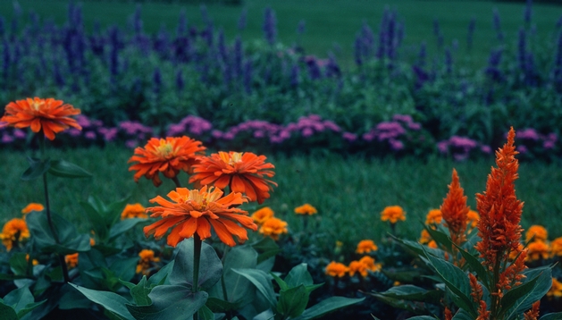
The complementary color scheme uses colors that are directly opposite each other on the color wheel. Examples are red and green, orange and blue, yellow and violet. Some very striking uses of color can be made with complements. Orange and its complement blue could be combined in a planting of tall blue lavender with a border of orange marigolds. Yellow petunias planted with blue saliva in a terra cotta pot would be a complementary color scheme.
The triadic harmony uses three colors that are an equal distance from each other on the color wheel. For example, yellow sunflowers, red zinnias, and blue morning glories form a triadic harmony. This unusual, but very attractive scheme not only gives you more color, but it gives you the opportunity to have a greater variety of plants.
Leave a Reply
You must be logged in to post a comment.